A workspace with nothing in the way
If you're new here: OneCamp is a self-hosted workspace (chat, tasks, docs, calls, calendar and AI agents) that you install on your own server. It is open source and free for up to 25 people.
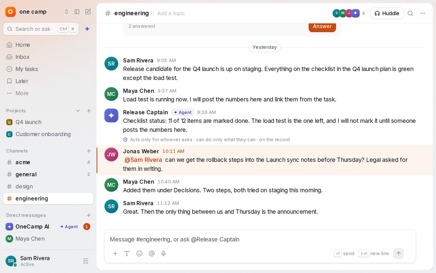
The last post gave OneCamp colour. The verdict that came back was fair: better, but not yet premium. Premium isn't more colour. It's fewer things between you and your work, and each thing that's left behaving perfectly. So this round rebuilt every screen, all of them, to that standard.
Nothing above the page
The top bar is gone. Everything it held now lives in the sidebar:
- the workspace menu at the top, with invite, settings and help;
- Search or ask right under it (Ctrl K), with the AI button beside it;
- you at the bottom: your status, focus time, pause notifications, and the theme.
The page itself is a sheet that sits slightly above the frame. You can drag the sidebar's edge to resize it, fold it to a rail with Ctrl \, and hover the rail to peek. Activity is now Inbox, and the bell's nudges from OneCamp AI live at the top of it instead of in a dropdown nobody opened.
New accounts follow your system's light or dark setting.
One palette, two modes
Ctrl K opens one palette. Type to jump anywhere, or press Tab to Ask: the answer streams in, with chips for the channels, docs and tasks it came from and a line that says it only read what you can open. Ctrl Enter takes the conversation into the AI panel. Space previews a result; Ctrl Enter on a result opens it beside the page.
Every area, rebuilt
- Chat. A floating composer, message rows on one grid,
:emoji suggestions, read receipts with the person's face, file cards, a photo viewer, voice clips that play in place, and a single Details sheet for a channel where every setting saves as you change it. - Tasks. Lists grouped by status with one toolbar, a check that strikes the task through with an undo before it moves to Done, My Tasks grouped by when things are due, a task panel with every property in one grid, and a create composer with a key for each field. The counts under a project's name filter its list, and Back undoes the filter.
- Docs, tables, boards and the calendar. A quiet doc header and a formatting bar that only appears over a selection; a slash menu; collaborators' cursors with name flags. A table grid with a focus ring that glides from cell to cell. Boards without a top bar, with a timer, voting and comment pins that show who wrote them. A calendar where you drag to create, move and resize, with undo.
- Home, search, inbox and the AI. Home leads with what needs you now, which you can finish in place. Search groups results by kind. The AI record names the agent that acted.
- Admin and settings. Settings take over the sidebar with their own menu and search (Ctrl ,). Every setting saves as you change it, and risky actions ask you to type the name first.
- On a phone. Sheets you drag to dismiss, large titles that fold into the bar, pages that slide in, pull to refresh, and a toast that sits above the tab bar or the message box.
Faster where you feel it
Measured on production builds with the same data, before and after, mostly with the CPU slowed four times:
| What you do | Before | After |
|---|---|---|
| Open the app: time the main thread is busy | 4.5 s | 0.7 s |
| Type in a message box: components updated per key | 28 | 10 |
| Type in a long thread: time the app was blocked | 1.5 s | 0.09 s |
| Scroll a long channel: components updated | 158 | 62 |
| Type in a doc: slowest keys (p95) | 48 ms | 24 ms |
| Switch a project to Board | 241 ms | 44 ms |
| Switch the calendar to Week | 48 ms | 16 ms |
| Scroll a 1,000-row table: components updated | 40,000 | 14,300 |
The project page also downloads its own code only when you need it: its own chunks went from 155 KB to 82 KB compressed.
A few things got slightly slower, and I'd rather say so: opening a task takes about 66 ms longer, because the panel draws more, and the first switch to a timeline about 30 ms longer. Both are below what you'd feel, and both are on the list.
What it found on the way
Holding every screen to one standard turned up real bugs:
- The demo showed real accounts. The demo visitor's people pickers listed everyone on the server, and the visitor could ask the assistant to message one of them. Both now reach only the demo's own people.
- An agent could break through a pause. "Notify anyway" didn't check who was sending. Now only a person can reach someone who has paused notifications or is in focus time.
- Activity skipped items. The feed cut times to the second, so two things that happened in the same second could lose one. Times now keep their fractions.
- Headings drawn at body size. A helper that merges styles was dropping the new type sizes when a colour followed them, so "Good morning" rendered at 14 px.
Getting it
The live demo runs it now, no sign-up. If you run OneCamp yourself, update soon: this release also fixes a security bug where reactions could change content they didn't belong to. Re-run the install command you installed with, then make update; it takes a backup first. It's free for up to 25 people, and the code is on GitHub.
Filed under OneCamp, Design, UX, Performance, Slack Alternative, Self-Hosted, OpenSource.
Get the next one
I write these as I build OneCamp: what broke, what it cost, and what I changed.